
Sneak Peek — What I Worked On.
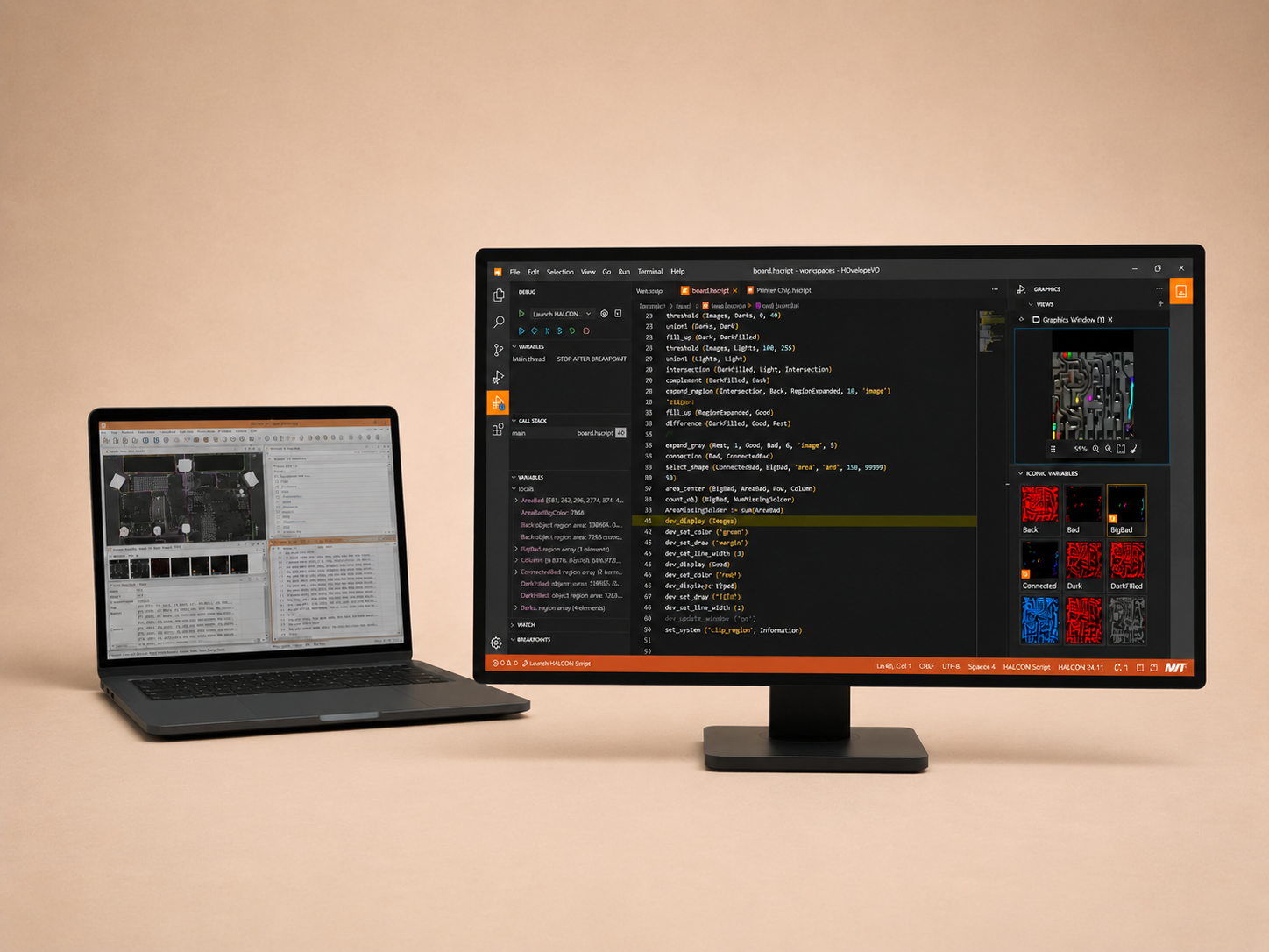
Not my biggest or most complex project at MVTec, but the one I can share publicly, and a good look at how I work.
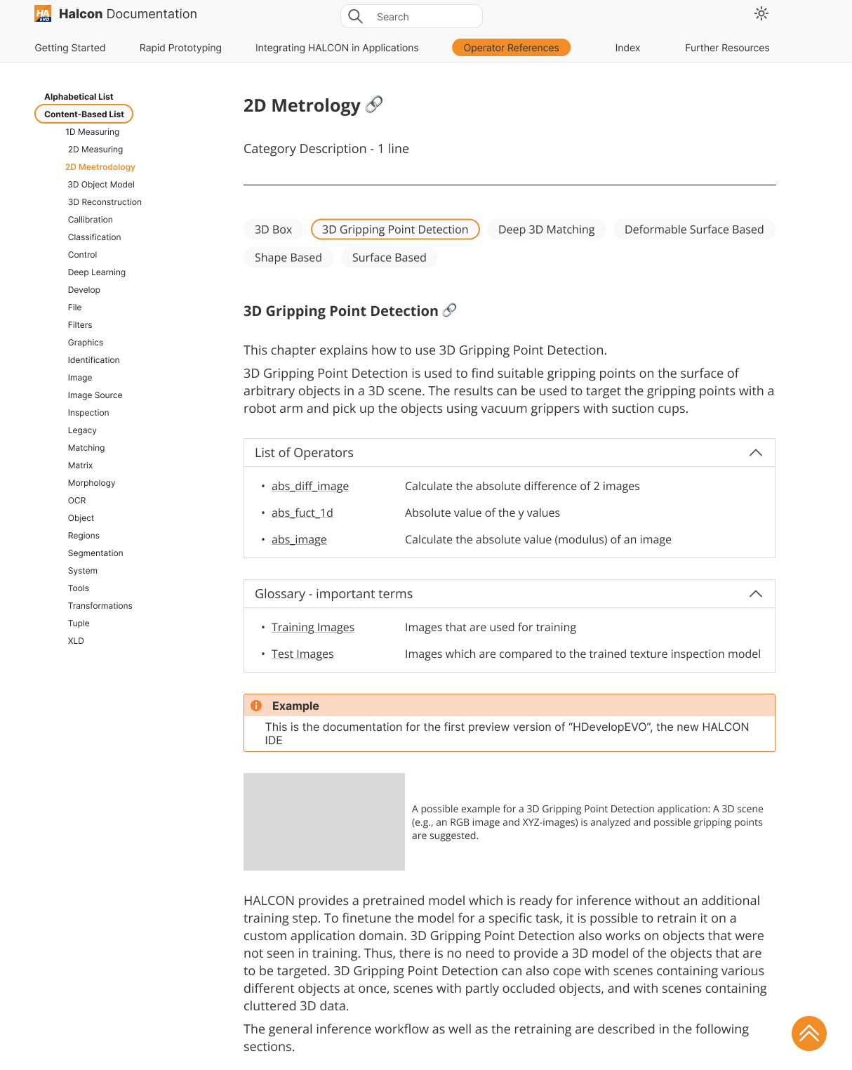
Documentation HDevelopEvo
UI/UX redesign of the existing HDevelop documentation into a website format that made sense.
Other Projects I've Worked On
I've worked on multiple projects across different areas and products, each with its own focus. My experience spans research, user testing and prototyping, with numerous iterations and close collaboration with software developers and other UX designers.
Modern machine vision software was powerful — but power came with complexity.
At MVTec Software GmbH, three core products were undergoing a fundamental transformation. This wasn't just a redesign — it was a rethinking of how users interacted with complex systems. Working as part of an in-house UX team, we tackled this challenge together across design, research, and engineering.
A modernized UI
We rethought the visual and interaction layer for expert users working in high-stakes environments.
A restructured codebase
The backend was actively being refactored — design had to move alongside an evolving foundation.
Future-ready scalability
Some parts were already in beta — others were still evolving. Flexibility was non-negotiable.
How might we redesign complex tools for two very different users — experts who relied on the existing system, and newcomers who needed clarity from day one — without breaking either experience?
Existing Expert Users
Deeply familiar with the existing system. Any disruption to their established workflows created resistance and lost productivity. Change had to feel like an upgrade — not a replacement.
New & Potential Users
Coming in without prior context. They needed consistent patterns, low cognitive load, and alignment with industry conventions — so the learning curve didn't become a reason to walk away.
Highly technical experts — working on precision-critical tasks.
Highly trained professionals who relied on the software for mission-critical machine vision workflows.
Errors in interaction translated to errors in output — the interface had to earn trust at every step.
Users were very familiar with existing patterns and software. Change had to feel like an upgrade, not a disruption.
Long sessions with many parallel tasks — energy spent on navigation was energy lost on the actual work.
The interfaces reflected mostly system architecture.
Through ongoing collaboration and analysis, one core issue became clear: the UIs had grown around technical structure rather than the mental models of the people using them.
The challenge wasn't to simplify the software — it was to make complexity usable.
Cognitive Overload
High information density without clear structure made it hard to focus on what mattered most.
Inefficient Workflows
Repeated tasks required too many steps — slowing down expert users unnecessarily.
High Learning Curve
New users faced steep onboarding even for standard operations, making the software less accessible to newcomers.
Deviation from Industry Standards
Interaction patterns diverged from familiar tool conventions, adding unnecessary mental effort to understand established workflows.
Four Strategic Directions.
Designing Alongside a Moving System
Unlike typical UX projects, the foundation (codebase) was actively changing. Instead of designing fixed solutions, we focused on flexible, future-proof structures that could adapt as the system evolved.
- Flexible design patterns over rigid specs
- Future-proof component structures
- Close, continuous collaboration with developers
- Iteration within real, living constraints
Creating Consistency Across Products
With three products evolving in parallel, fragmentation was a real risk. Our work focused on identifying shared patterns and establishing principles that could travel across all three surfaces.
- Aligning interaction patterns across products
- Establishing shared UI principles
- Supporting a more unified user experience
- Reducing redundant design decisions
Reducing Cognitive Load for Expert Users
Rather than oversimplifying, we focused on making the interface feel lighter — without removing its power. The goal was to let experts think about their work, not the tool.
- Clear information hierarchy throughout
- Logical grouping of tools and data
- Streamlined workflows for repeated tasks
- Progressive disclosure for advanced features
Bridging UX and Engineering
A key part of our role was translation — turning user needs into technical requirements, and system constraints into design decisions. This required continuous alignment and negotiation of real trade-offs.
- Translating user needs → technical requirements
- Translating system constraints → design decisions
- Continuous alignment with development team
- Iterating within real, not ideal, constraints
Contributions that made a difference.
Grounded in real workflows and user needs.
Key workflows became more intuitive and efficient for expert users — reducing friction in precision-critical tasks.
Shared UX decisions reduced fragmentation — users encountered familiar patterns regardless of which product they opened.
A clearer, more structured interface lowered the barrier for new users — making the software more accessible without sacrificing depth.
UI patterns moved closer to established conventions, so users spent less time learning the tool and more time doing their work.
This job fundamentally changed how I think about UX.
Complexity wasn't the problem — unstructured complexity was.
Designing for Two User Types at Once
Expert users needed power and speed — but new users needed clarity and guidance. I learned to layer the interface so it worked for both: familiar and fast for those who knew it, approachable and guided for those who didn't.
Working in Evolving Systems
When the ground kept shifting, flexibility became a design principle. I learned to document decisions, not just outcomes — so the reasoning survived the next iteration.
Convention as a Feature
Aligning with industry-standard patterns wasn't a creative compromise — it was a usability decision. Familiar structures let users focus on their task, not on learning the tool.
Balancing Ideal vs. Real
The best design decision was the one that could actually ship. I developed the ability to negotiate trade-offs without losing the core user benefit.