

This project is personal.
I've lived both sides of this program.
The LMU Buddy Program pairs incoming exchange students with experienced LMU students. Buddies help them navigate university life, settle into Munich, build connections, and find their footing in a new environment.
I've been part of this program on both sides — and seen exactly where its good intentions break down. This project is a direct response to both experiences.
Exchange Student
I spent two semesters abroad — experiencing firsthand what it means to arrive somewhere new without enough support.
LMU Buddy
I spent four semesters as a buddy — motivated to help, but lacking the tools to do it to the full extend.
The program has the right intent — but neither side has the tools to make it work.
The program relies entirely on informal coordination — no platform, no shared space, no structure. It works when individuals fill the gap themselves. Most of the time, they can't.
No dedicated platform for either side
Buddies and exchange students rely on WhatsApp and email — no single place to coordinate or find program information.
No structure for the buddy relationship
Most pairings fade after the first messages. Buddie s have no way to track contact or know if their support is landing. A lot of internationals get the needed support to late.
No community or shared events space
Events and social opportunities exist but are impossible to discover. There's no community layer connecting exchange students to each other or to the buddy network.
Design a dedicated mobile experience that activates the LMU Buddy Program, giving exchange students and their buddies the structure, tools and motivation to build a meaningful connection.
A structured connection app built around the exchange experience.
LMU Buddy gives the program a digital backbone: onboarding, matching, communication, and event discovery — in one app.
Smart buddy matching
Matched by faculty, home country, and language — designed for the exchange student context.
Structured onboarding
Guided first steps prompt both sides to connect and schedule their first meeting before the semester gets busy.
In-app messaging
One place for chatting and sharing documents, no more scattered channels.
Event discovery
Events that offer easy participation and options to actively get to know the new city.
The problem was real, but the existing experience wasn't designed well.
face a compressed transition — housing, registration, language, and social isolation all within the first 2–3 weeks
research shows peer mentorship accelerates integration and reduces isolation in the first weeks abroad
LMU buddy pairings often "fade out" within 2 weeks — not from lack of interest, but from lack of structure
are motivated to help but lack tools to stay in touch — good intentions that fade once their own semester picks up
Bureaucracy, housing, and a new city — the exact tasks where a buddy could help. But program info is scattered with no single place to start.
Research Method Note
A content review of the LMU Buddy Program website and qualitative interviews with students who had participated as buddies or exchange students surfaced the "fade-out" pattern as the central design problem.
Two distinct users — one shared semester.
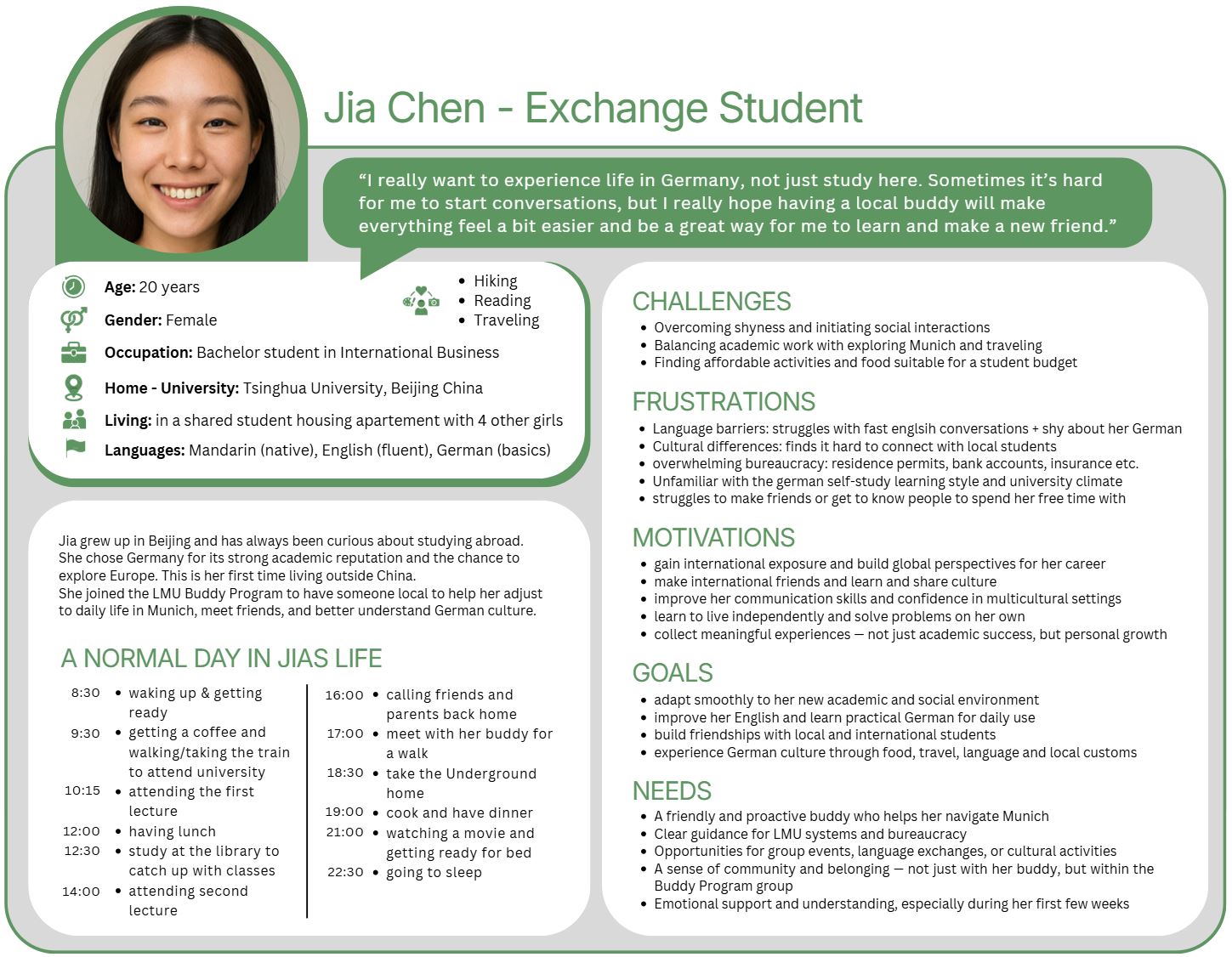
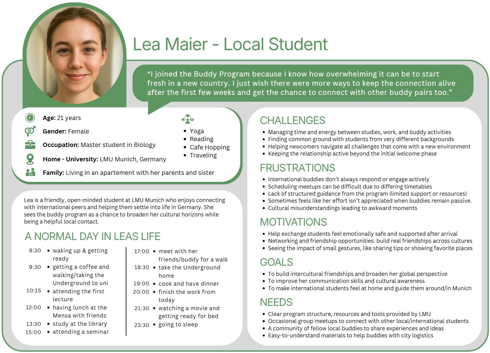
The app serves both sides of the pairing. Needs diverge sharply in the first weeks and converge as the semester progresses. Later in the project, a third user group was added — programme administrators, who organise the programme and supervise the buddy pairings.
Arriving for one or two semesters. Need practical info, a reliable contact, and orientation before their first lecture.
Motivated LMU students who signed up to help. Need tools that make staying in touch feel easy, not like admin work.
Exchange students arrive from many countries. Language accessibility and culturally neutral design were non-negotiable throughout.
A dedicated app — not a web portal — fits how students look for help during orientation.
Both users operate at high cognitive load early on. Every feature had to justify its presence — if it added steps without value, it was cut.
Sketch, Build, Test, Repeat.
Four rounds of iteration — each one answering a specific question about user behaviour or interface logic
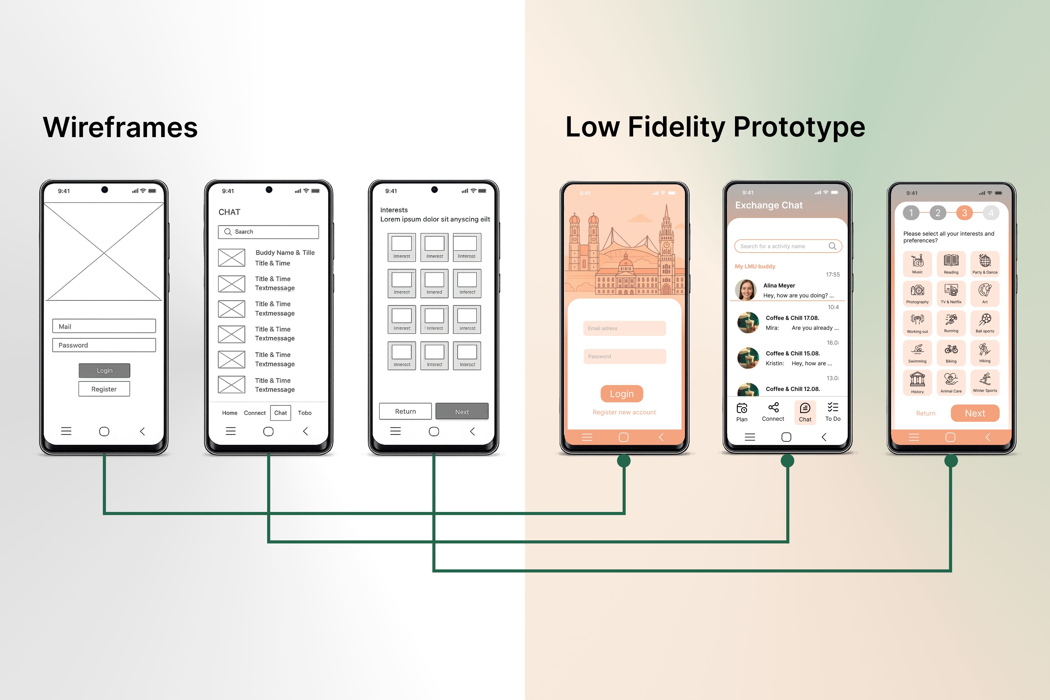
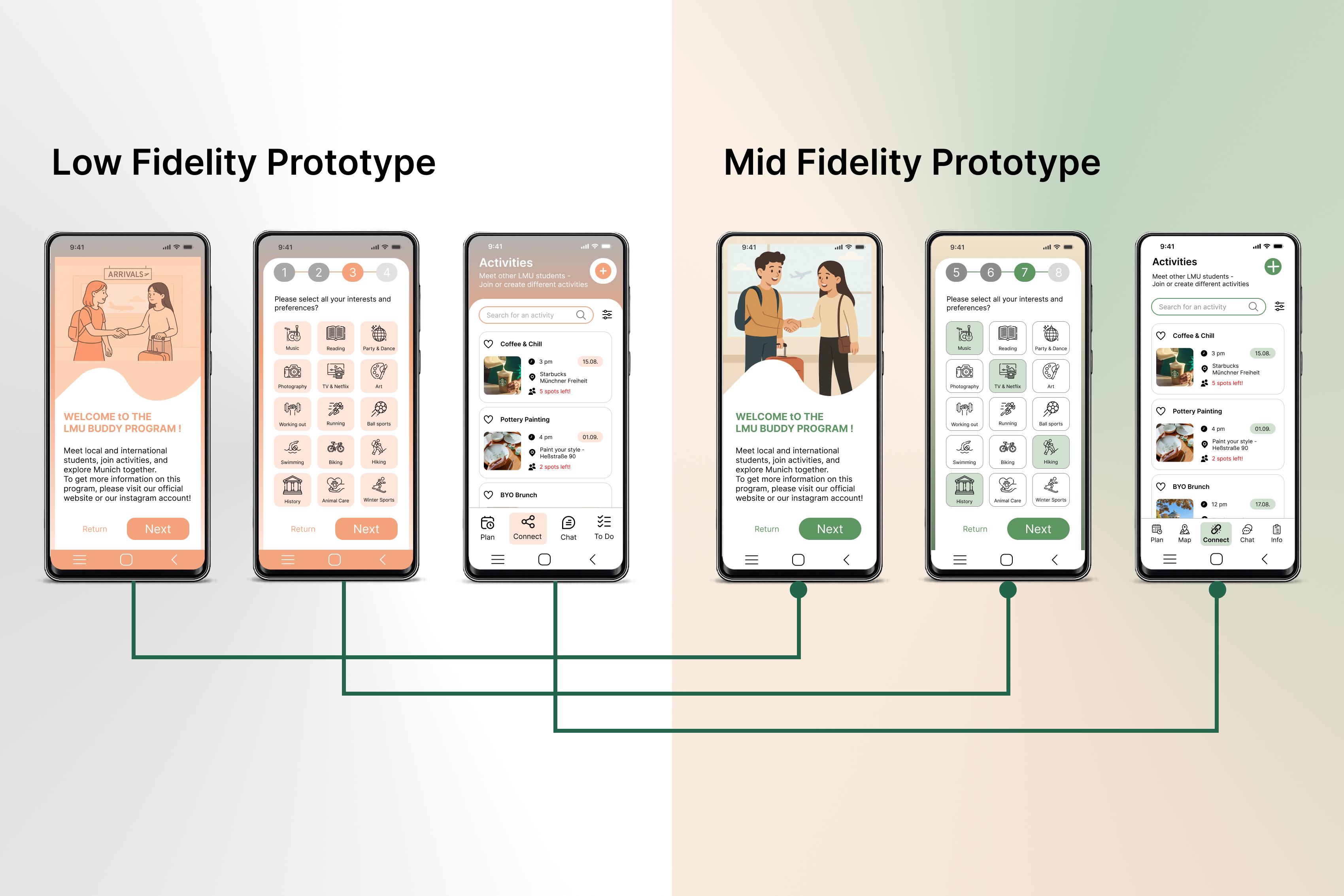
My process started with creating wireframes to explore layout ideas without getting attached to visual details too early. These wireframes helped me focus on structure, hierarchy, and the overall user journey before moving into visual design decisions. Afterwards, they were translated into low-fidelity screens in Figma — adding more structure, defining the user flow, and organizing the information more clearly across the different screens.
The mid-fidelity prototype introduced more realistic content and a clearer visual structure. I added illustrations and refined the visual direction by replacing the earlier orange tones with green and beige colors to create stronger contrast and align the design more closely with LMU's visual identity. I also started creating an actual prototype flow by connecting screens and interactions, making the experience more understandable and easier to navigate. The transition mainly focused on resolving the most critical issues from the low-fidelity prototype, including:
- Improving color and contrast
- Creating a clearer visual hierarchy
- Establishing a more structured and understandable flow
- Refining the overall visuals and clarity
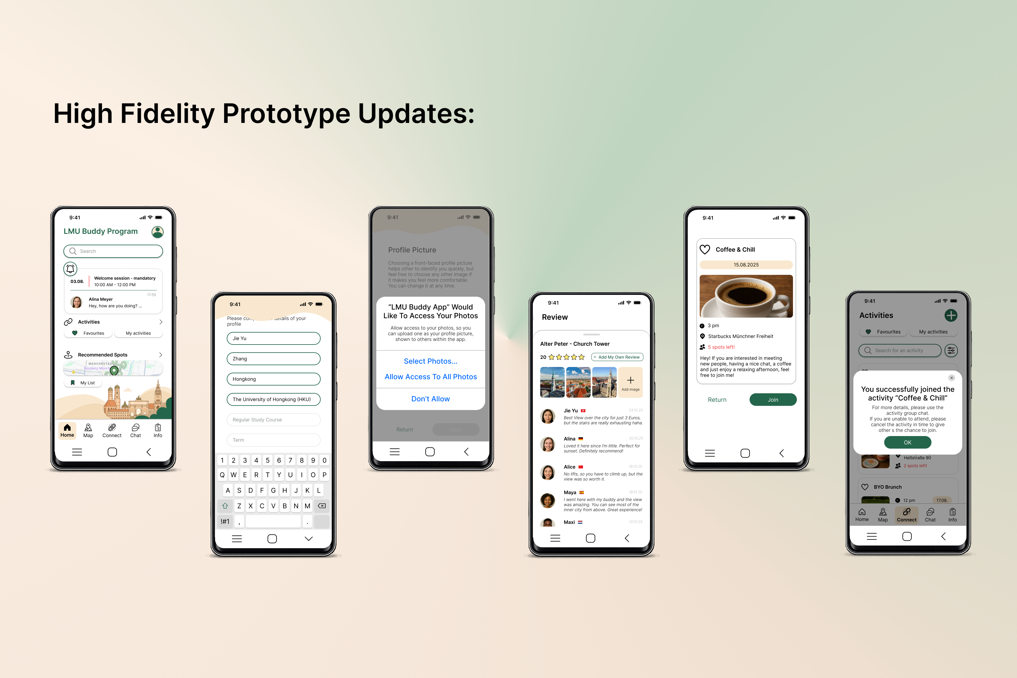
For the high-fidelity prototype, I expanded on the visual design from mid-fidelity and created more detailed, realistic screens — refining onboarding and registration flows, adding pop-ups and typing interactions, and introducing additional screens to make the app feel like a complete product experience. I also started designing different interaction and feedback states, including:
- Pop-ups and confirmation interactions
- Loading states
- Error states
- General user feedback states
I also created separate onboarding experiences for local and international students to ensure that both user groups were properly supported depending on the information required by the university.
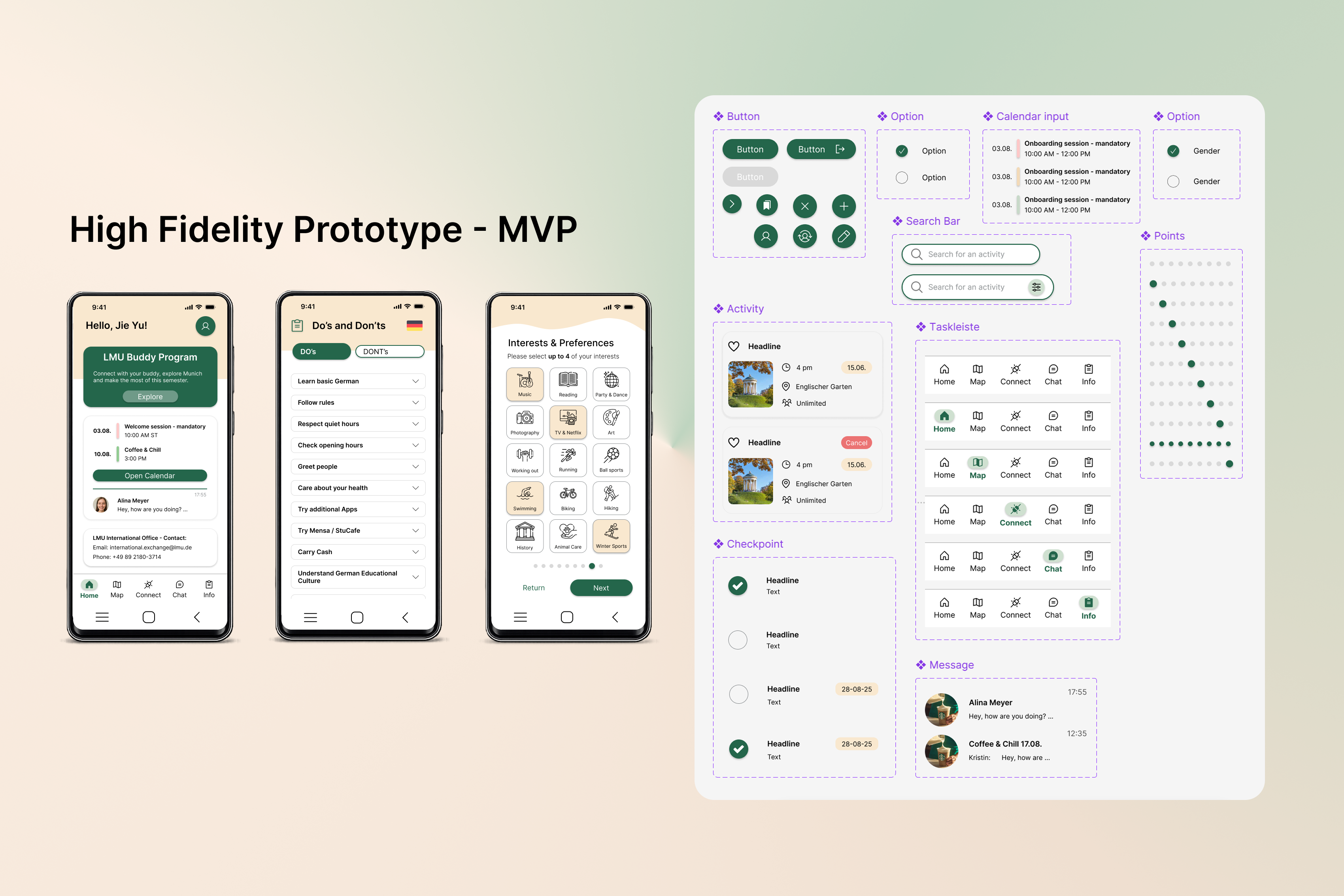
To transform the high-fidelity prototype into the final MVP, I focused on improving consistency, clarity, and accessibility across the entire product. I refined the color palette by making the green tone darker to ensure sufficient contrast, and created a component library that included:
- Consistent components
- Consistent icons
- Consistent colors
- Consistent spacing
These components were applied across all screens to create a more unified and scalable design system. I also adjusted the homepage to reduce information overload, finalized the overall flow, and started adding an admin view alongside the student-focused experience. Finally, I incorporated accessibility considerations into the MVP, including:
- Language switching
- Improved contrast
- Clearer accessibility support throughout the interface
The final MVP — scoped to what matters most.
AI-powered matching
- AI-powered matching based on personal information and interests
- Considers faculty, home country, and language preferences
Everything you need, in one place
- To-do list, emergency contacts, cultural do's & don'ts
- University links, data policy & terms of use
- Content tailored to exchange or local students
Connect, discover, and stay in touch
- Join or create activities for other users to participate in
- Shared calendar with activities and official programme events
- Student-rated place reviews across Munich
- Buddy chat and automatic group chats per activity
Visibility for programme coordinators
- Overview of all active buddy pairings and their current status
- Flag quiet relationships for follow-up and direct intervention
- Event management and user administration across the programme
Designed to work for everyone.
Language
Content available in English and the user's first language.
Readability
Plain language throughout, short instructions, and simple navigation for users with English as their second language.
Contrast & Visual Hierarchy
Color combinations and contrasts meet standards and are easy to identify. Tested for visual impairments such as color blindness, so states are also signalled by changes in font weight, not color alone.
Inclusive Onboarding
Simple, easy to follow step-by-step process.
High Credibility
University login and a report system ensure a safe and trustworthy environment.
Double Diamond — with deliberate divergence at each stage.
Research
- Content review of LMU Buddy website
- Interviews with buddies & exchange students
- Affinity mapping of findings
Ideation
- Mindmap
- Personas
- Problem Statement
- Goal
- User Group
- Solution Concept
Prototyping
- Wireframing
- Logodesign
- Low Fidelity Prototype
- Mid Fidelity Prototype
- Interactive High Fidelity Prototype
- Interactive MVP of Key Features
If this project continued, these would be the next priorities.
Field Study
User testing with the final prototype to validate the design before handoff.
Implementation of Adjustments
Apply necessary improvements based on field study findings.
Present to University
Present to LMU for feedback and approval of the concept and design direction.
App Implementation
Full development of the app including the AI-powered matching feature.
What I'd do differently.
Test the actual prototype earlier
Participants were primarily asked before the prototype was created. Real user feedback during the process would have provided important insights into the design direction.
Involve programme coordinators from the start
The admin view emerged late in the process. Getting coordinator input earlier would have shaped the information architecture and operational constraints from the beginning.
Design for long-term relationships
The MVP solves the current problems well, but sustaining relationships long term remains an open design question.